
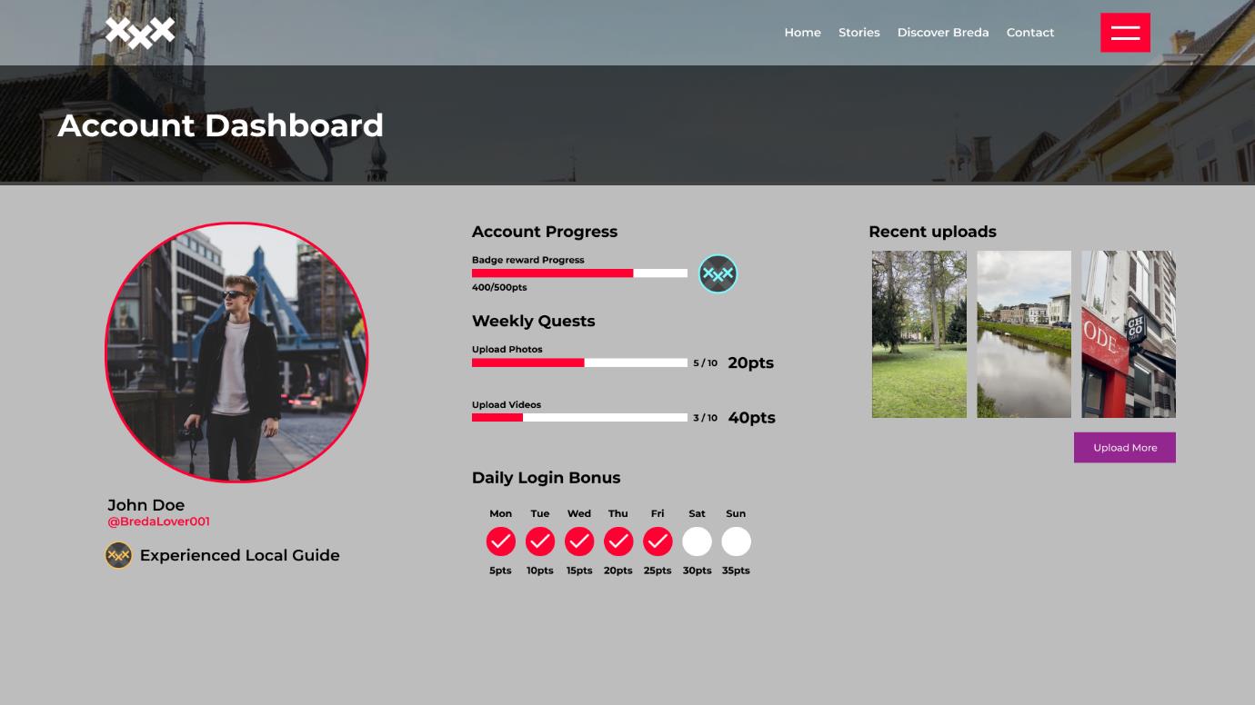
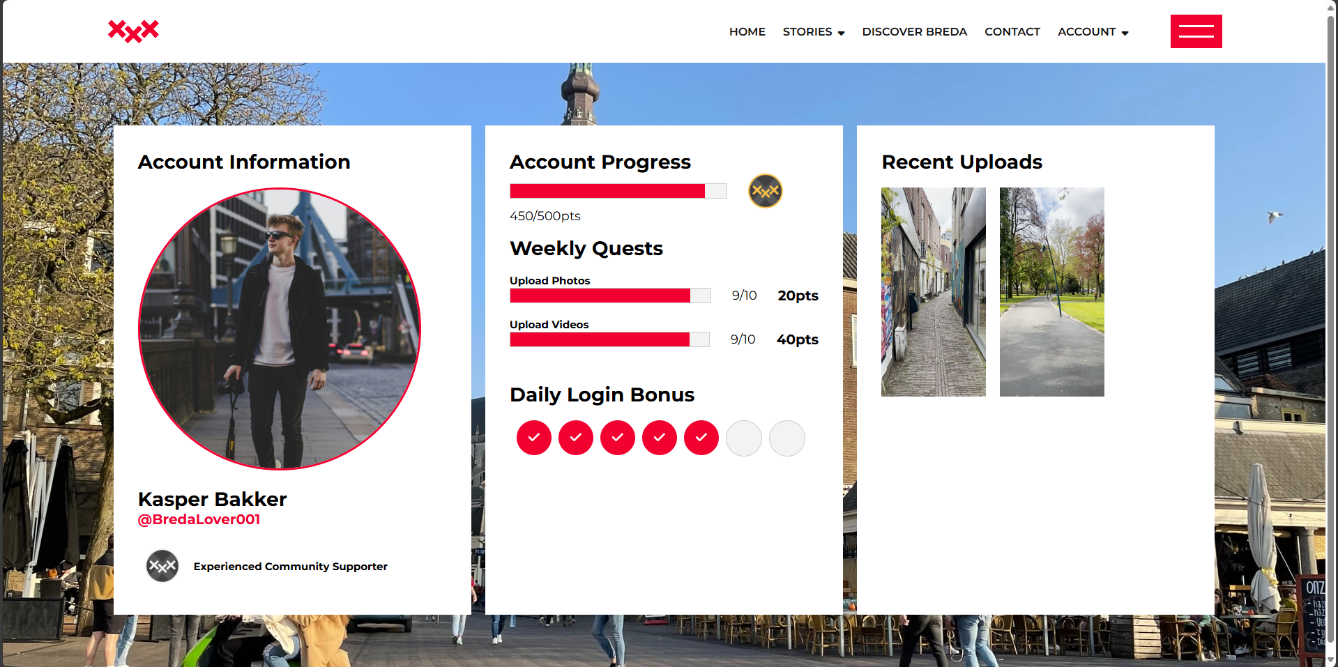
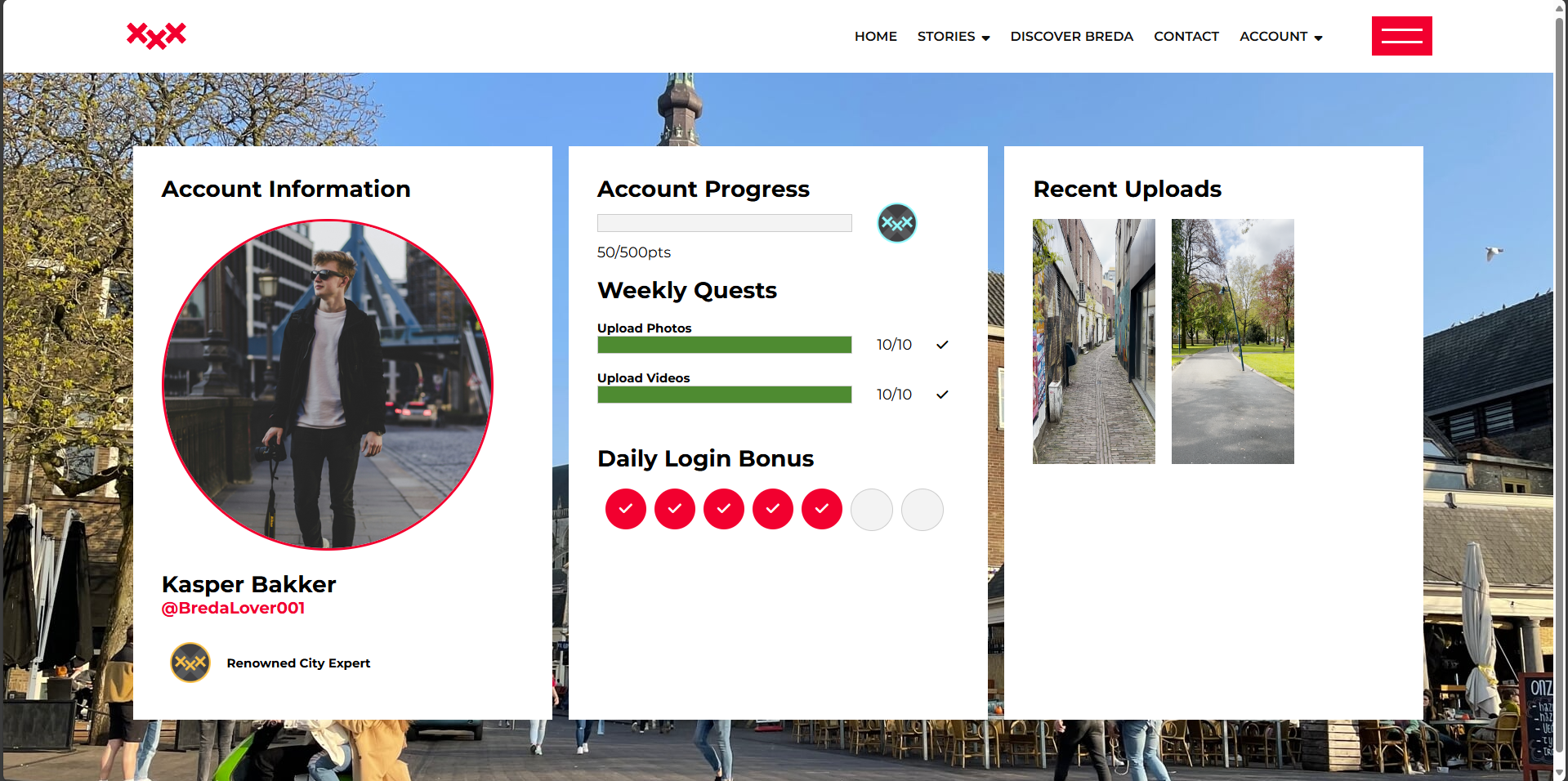
As the team divided the work on the subpages for the development project for our client Handpicked, I was assigned to creating a dashboard for the website user, where the account details, account progress and recent upload could be seen. I first started with making a FIGMA prototype that represented the visual concept of the dashboard, with an initial idea of how I wanted the subpage to look like when coded. When translating the idea to HTML and CSS I encountered some obstacles with positioning and sizing of certain objects but as a result I have come up with a fully coded website that resembled my initial Idea in a decent way. Here is the prototype I designed and the result I got after tranlating it to HTML and CSS.
In order to make the group website more entertaining I came up with an idea of a pop-up message that appears when the user uploads the files. It was coded to work with the particular button, opening the message and then closing it after a few seconds. I also added a way to close it manually by clicking the ‘x’ symbol or simply clicking outside of the message box.
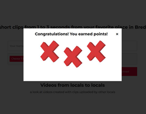
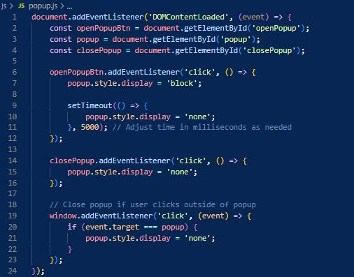
The crucial parts were delivered as desired, although I had to change a few visual aspects that caused me some trouble when coding. In the future I have to practice more the correlation between the HTML and CSS in terms of positioning and displaying the elements. In terms of the pop-up message, it was not that easy to implement my idea into the subpage because its complex code and already existing alert message interfered with each other, which required the team to put a little extra work but at the end the team made it work as desired.
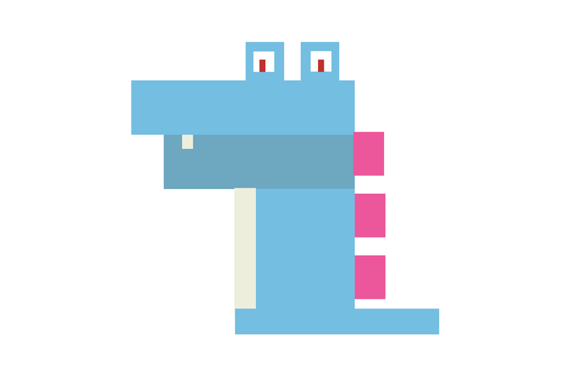
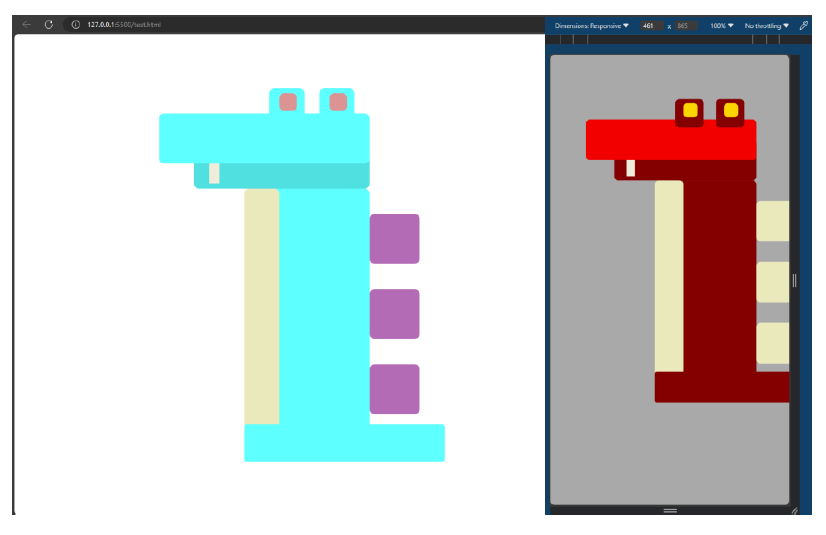
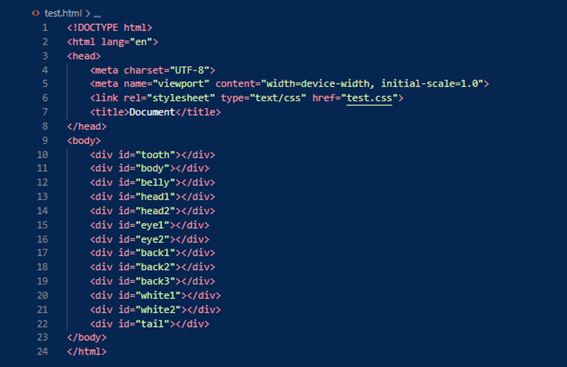
In one of the workshops I practiced a little with positioning of the objects in HTML by using the features of the CSS file assigned to the HTML one. The task was to recreate a favorite Pokemon using blocks. I firstly started with creating a rectangular shaped prototype that would give me a better insight how whould I modify the CSS in order to get a desired outcome. Then, I applied some responsive design that allowed my Pokemon Design to reposition more to the central part and change its color palette.
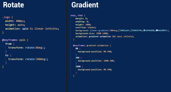
In order to make a desired loading screen as the first thing the user sees when opening my website, I had to learn more about using keyframes and several animation types available in CSS. For the logo, I decided to create a spinning animation that appears when the page is loading. I also used keyframes in order to obtain a nice and smooth gradient animation that will be a nice background addition. By using a similar technique, I managed to make the loading bar fill in time which gives the user a sense of progress.

In order to properly implement the curtain menu I had to make a good use of HTML, CSS and also JavaScript. The menu had to act in a particular behavior in order to not conflict with the rest of the page. Without the JavaScript part the menu could open and close, however I was unable to scroll down as this behavior was not available in the current settings and conflicted with the curtain menu functiionality. I also was able to code the bahaviour to the floating open button that now can change its status from visible to hidden, and other way around with a smooth transition.
I think I could have challenged myself more in terms of development. The first two projects did not require any development work and the short period of the third project limited the amount of coding that could be made. I plan to work more on the development aspect of the IT industry in the upcoming months by following the workshops that were provided by Fontys but not all of which I was able to attend because of the amount of time I had to spend on each project.