LO3: Iterative design

Nathalie's Brand Logo Design

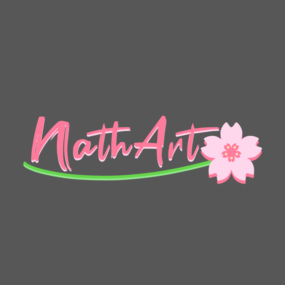
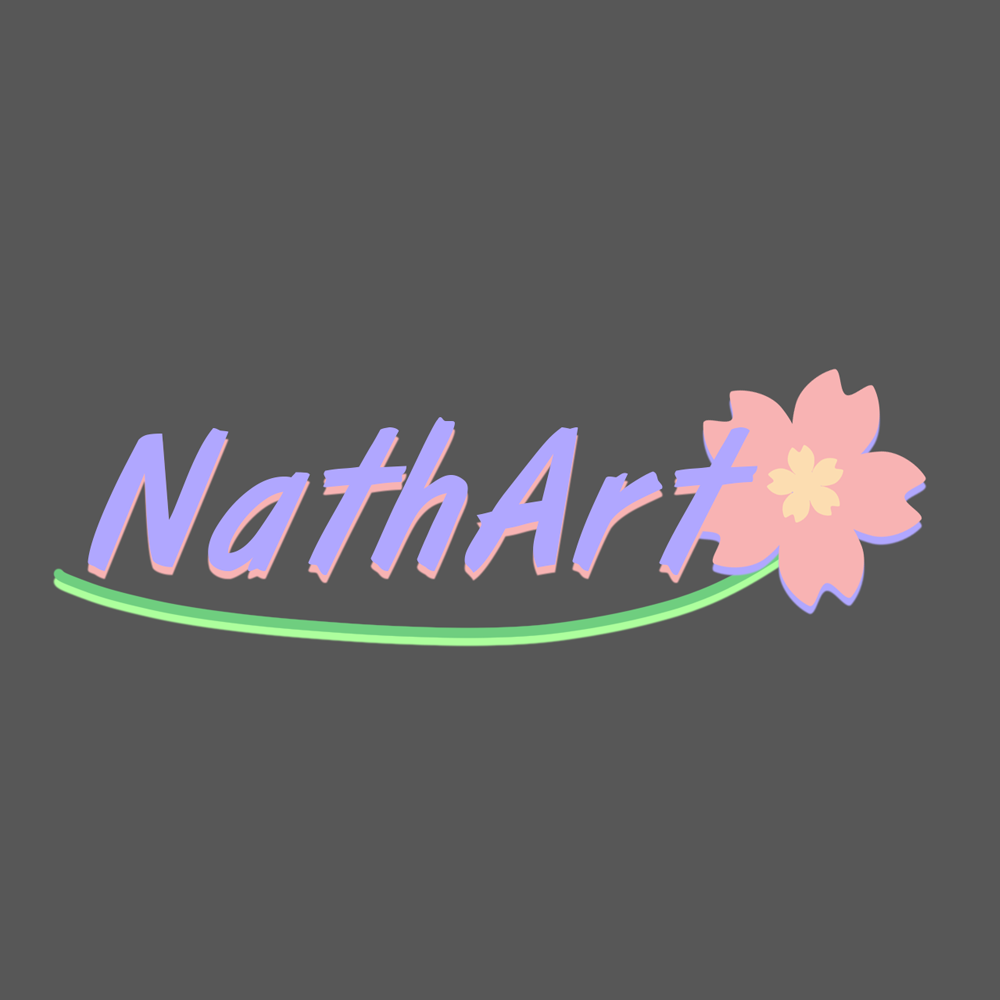
At the beginning of the branding project, each member of my group was responsible for delivering his ideas for the potential logo design for our client. After reviewing the propositions and asking for the feedback, the team managed to decide on the particular idea and explore it further. This were my design ideas and the iterations. The designs were supposed to contain Nathalie's name and some kind of blossom visible on the logo.

Logo Iteration 1
First iteration of the logo design. The font is based on a painting brush style and the flower is there together with flower's stem.
Logo Iteration 2
Second iteration of the logo changes the color palette, focuses more on a lavender color rather than pink. The font was changed, still resembling the paint brush style but more readable.
Logo Iteration 3
Third iteration was created after the client's feedback. Nathalie wanted something more simple and elegant, which caused the change to a more minimalistic flower design and a clean font with seriffs.

Stylescapes for Nathalie

In order to get an idea about the brands identity and design, it was essential to make several stylescapes throughout the process. After each iteration, I have received feedback from the client and also from my colleagues. These recommendations allowed me to improve the design and its crucial elements. The stylescapes that I made during the project are showed below.

Stylescape Iteration 1
First iteration of the brand stylescape. It focuses on a very artistic vibe of the brand with many pastel colors and creative design.
Stylescape Iteration 2
Second iteration of the logo changes the brand stylescape. It gives a more modern and professional vibe in comparison to the first iteration. The style was changed to more elegant and some elements were stylized to resemble a Pinterest feed.
Stylescape Iteration 3
Third iteration was the final outcome of the client's feedback and the group's design ideas. It maintained the elegant style but added some neutral colors to the palette and implemented some rectangular shapes into the brand visual look.

Brand Guide for NathArt

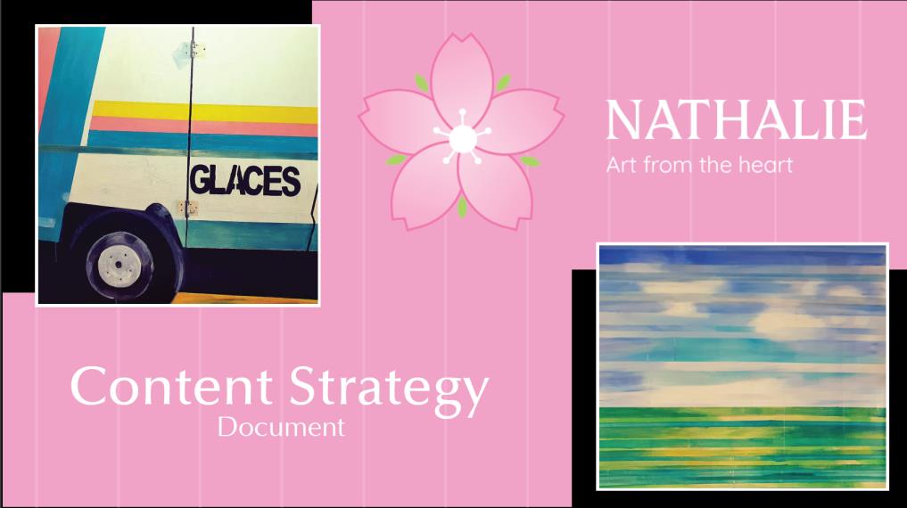
It was also my responsibility to design the visual part and the final shape of the Brand Guide and Content Strategy documents. As the brand guide was done earlier, before the final style was settled on, it had to go through a makeover which resulted in another iteration. Some of the changes implemented on the visual aspects are visible below.

Contents slide iteration 1
The content page of the first iteration of the brand guide. Very simple design with no additional elements, mostly plain text.
Contents slide iteration 2
Second iteration of the content slide with the updated brand style. What is more, some artwork of Nathalie was added in order to make the brandguide more visually appealing.
Logo design slide iteration 1
Slide presenting the logo design for the brand, consisting of a design description and decisions made but also the two versions of the logo, presented on both white and black background.
Logo design slide iteration 2
Second iteration of the logo design slide. Some elements were added to the page layout, like the logo color palette and the font name. It was also adjusted to the new style.

Content Strategy for NathArt

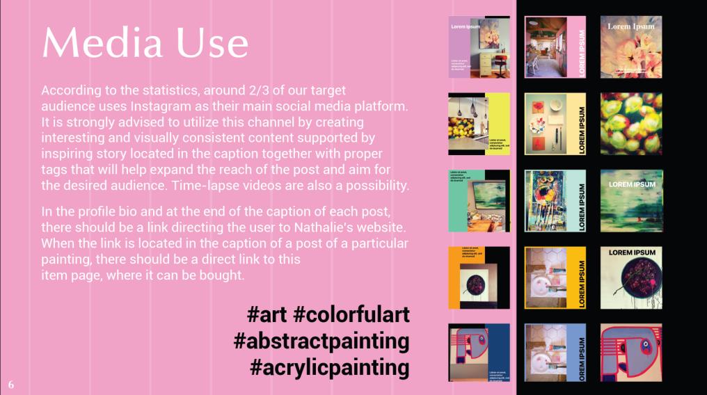
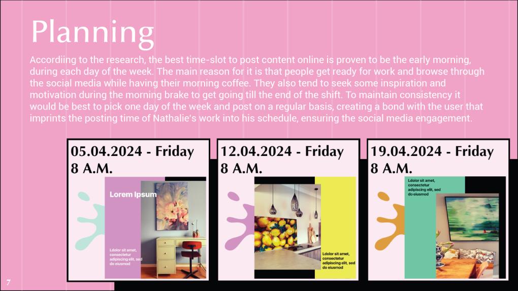
Here are also some parts of the content strategy document which was designed in a similar way to the branding guide pdf. It was supposed to mimic the look of the website prototype that was designed by my colleague.

Content Strategy cover page
The cover page of the content strategy document was designed to highlight Nathalie's brand. For this reason, the newly created logo and some of Nathalie's artwork was implemented into the page layout.
Content Strategy media use page
The media use significant aspect was the information that it provided to the client, but in addition some social media posts mockups were added in order to give the client a better insight on how to create the posts.
Content Strategy planning page
The planning page also focused more on the information rather than the visual aspects but I managed to implement some images that could help the client visualize the posting schedule.

Reflections

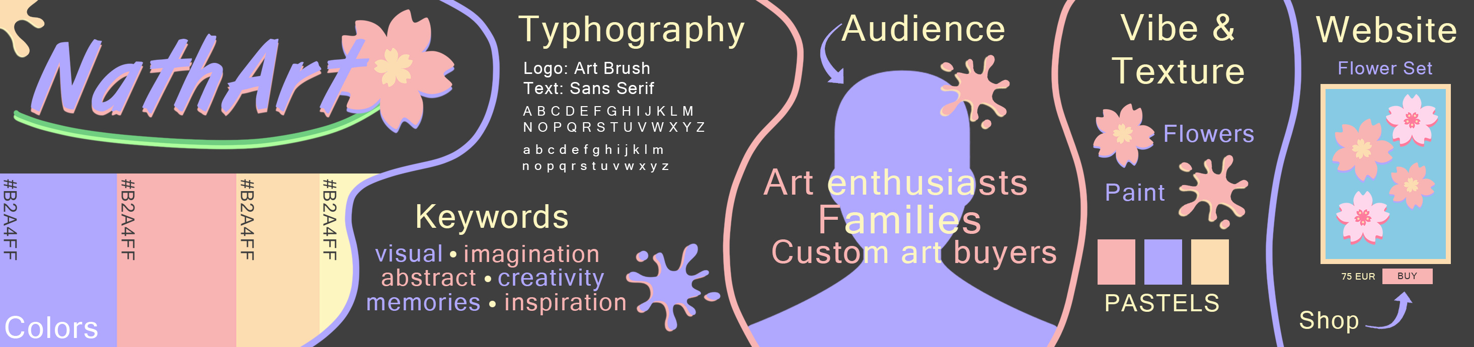
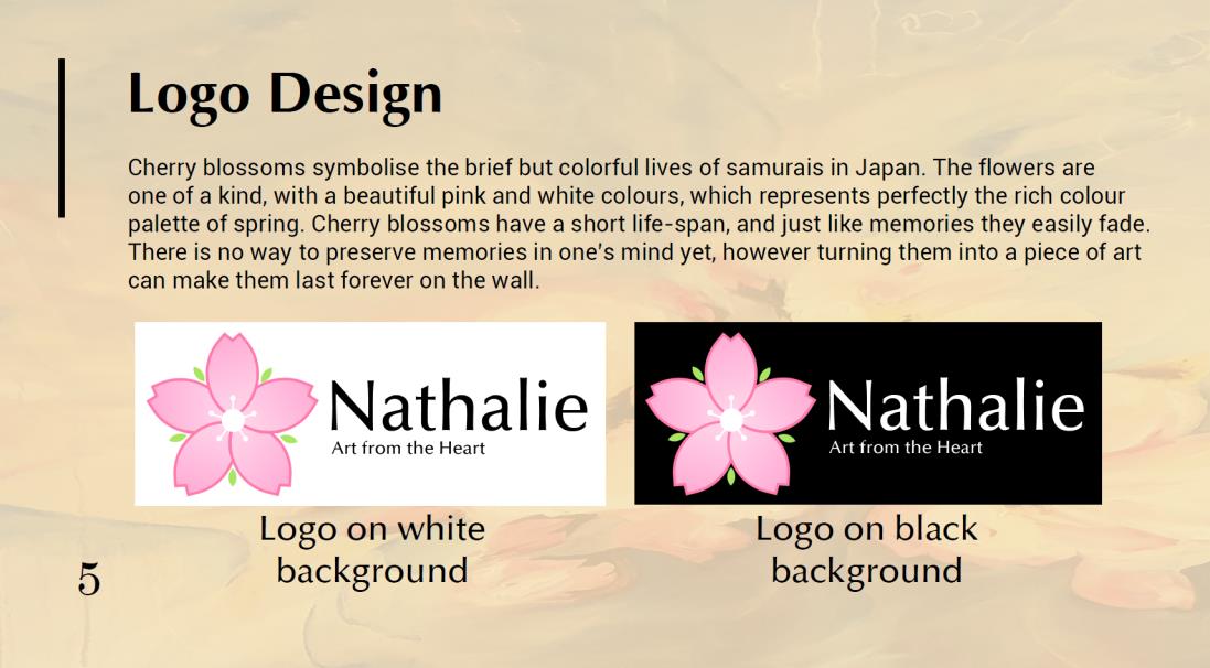
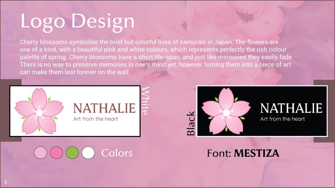
Since the client did not think of any brand narrative and brand values before, the style of the brand is something that the group had to invent based on the small amount of hints that Nathalie provided. For the first iterations, the only known requirements or rather suggestions that the design was based on were: pastel color palette and blossom in the logo. Since the Adobe Illustrator tool was not that familiar to me at the begining, I make my iterations in Photoshop, in which I had a greater experience. The fact that each team member had their own idea for the design, gave Nathalie a wide range of iterations she could choose from.

Explore Breda Local Guidebook Cover

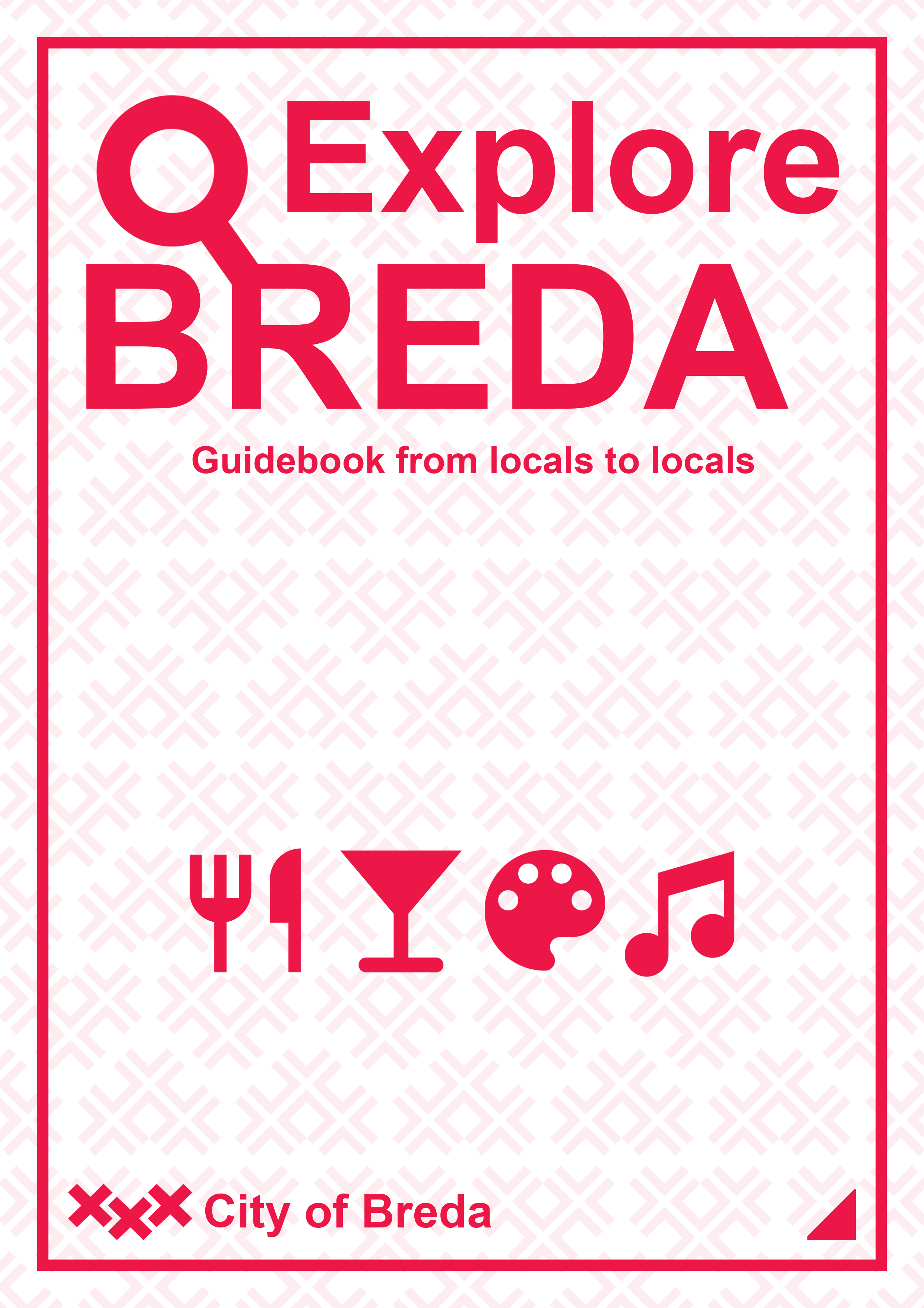
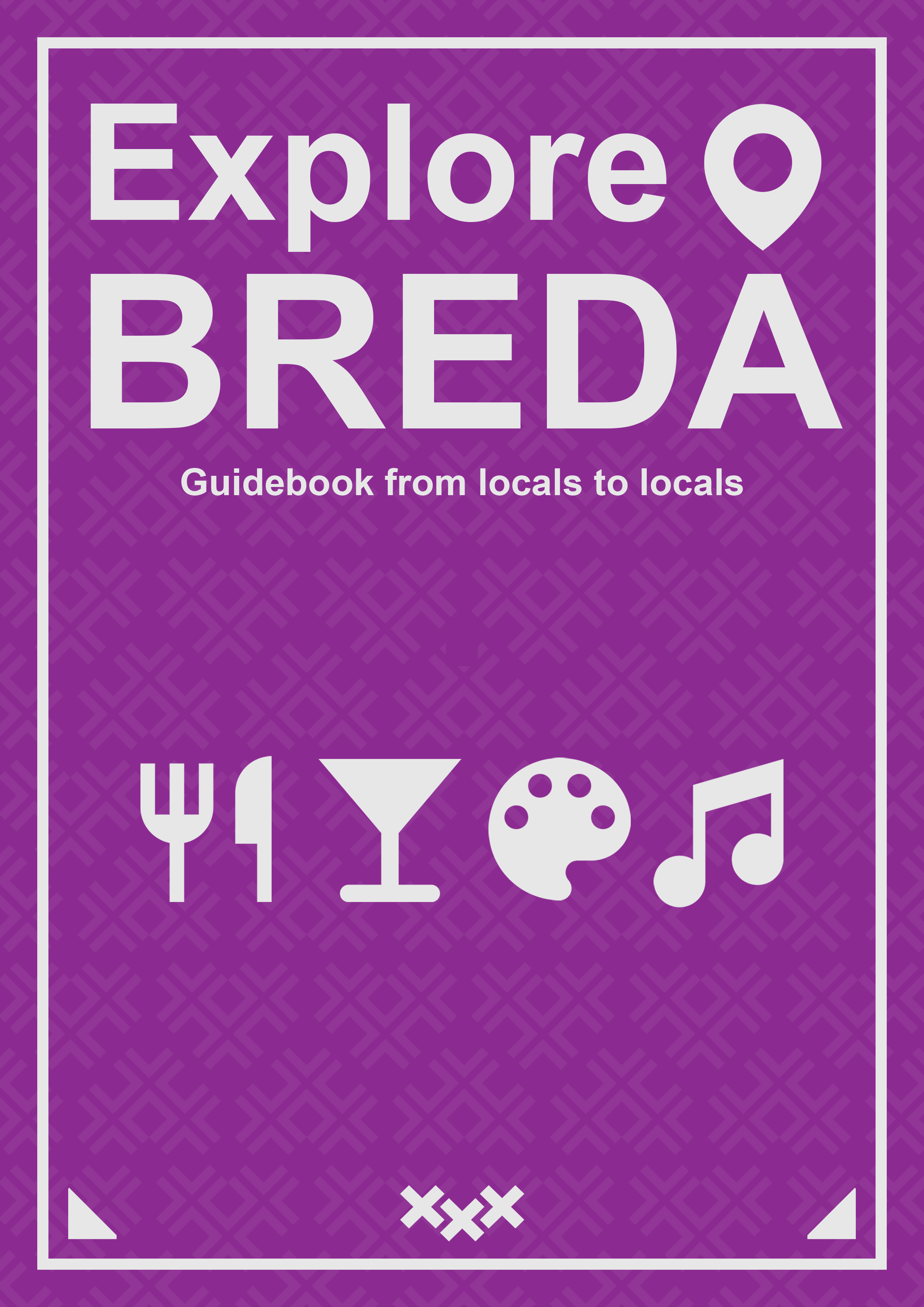
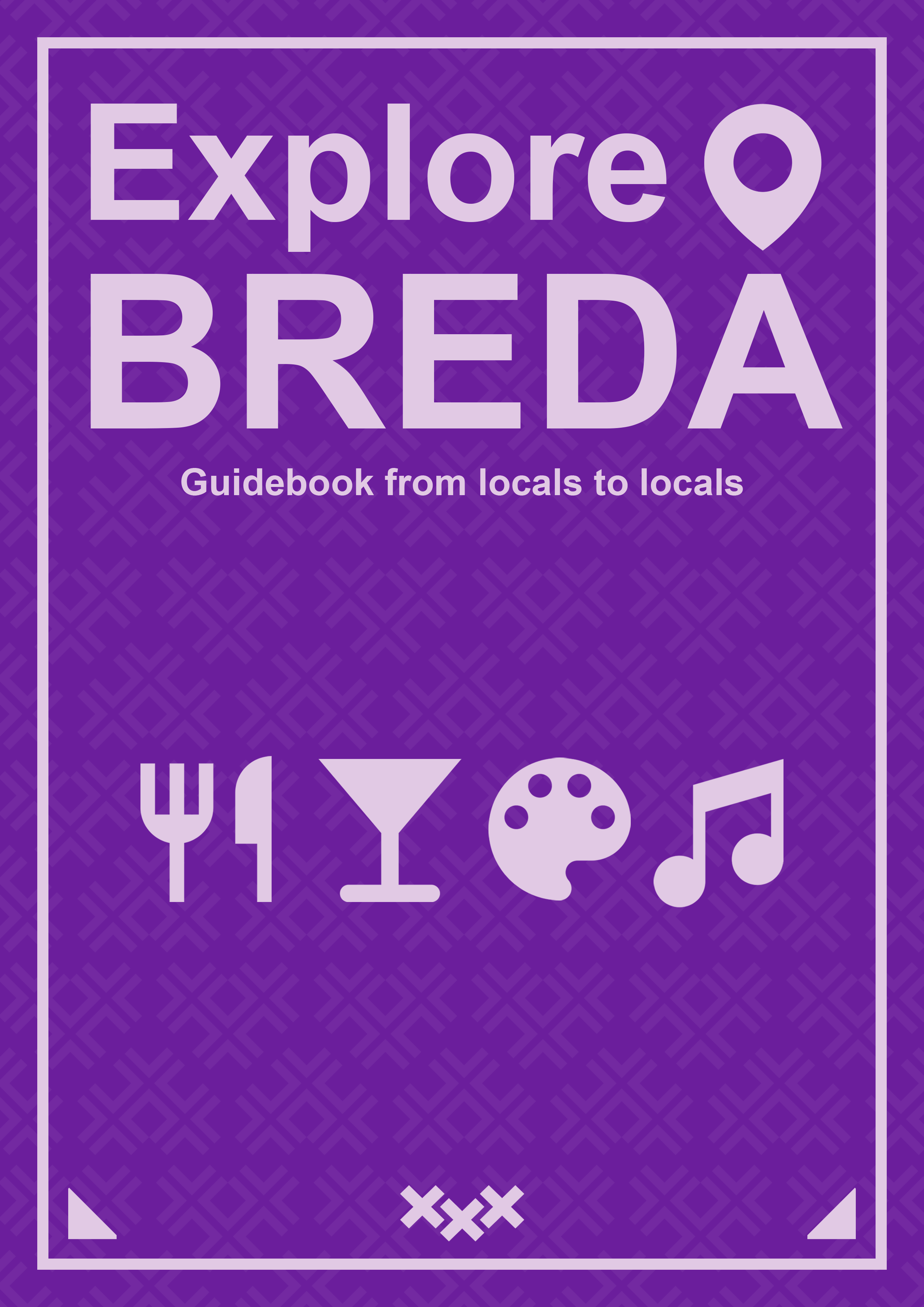
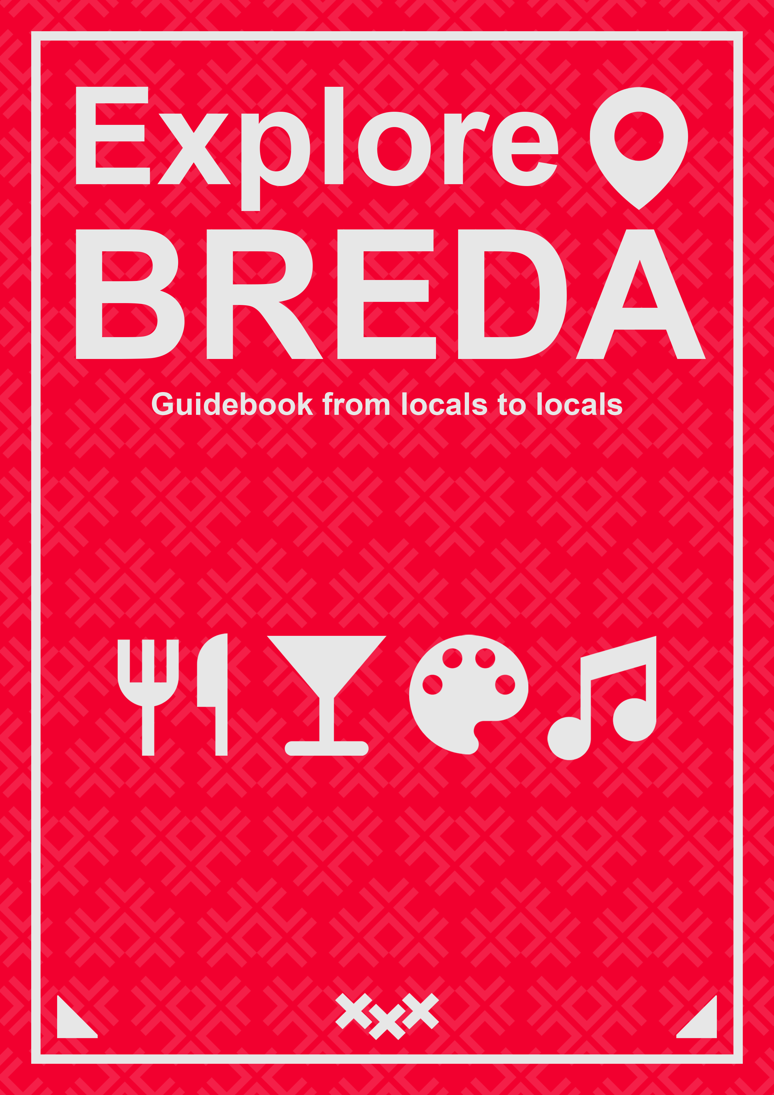
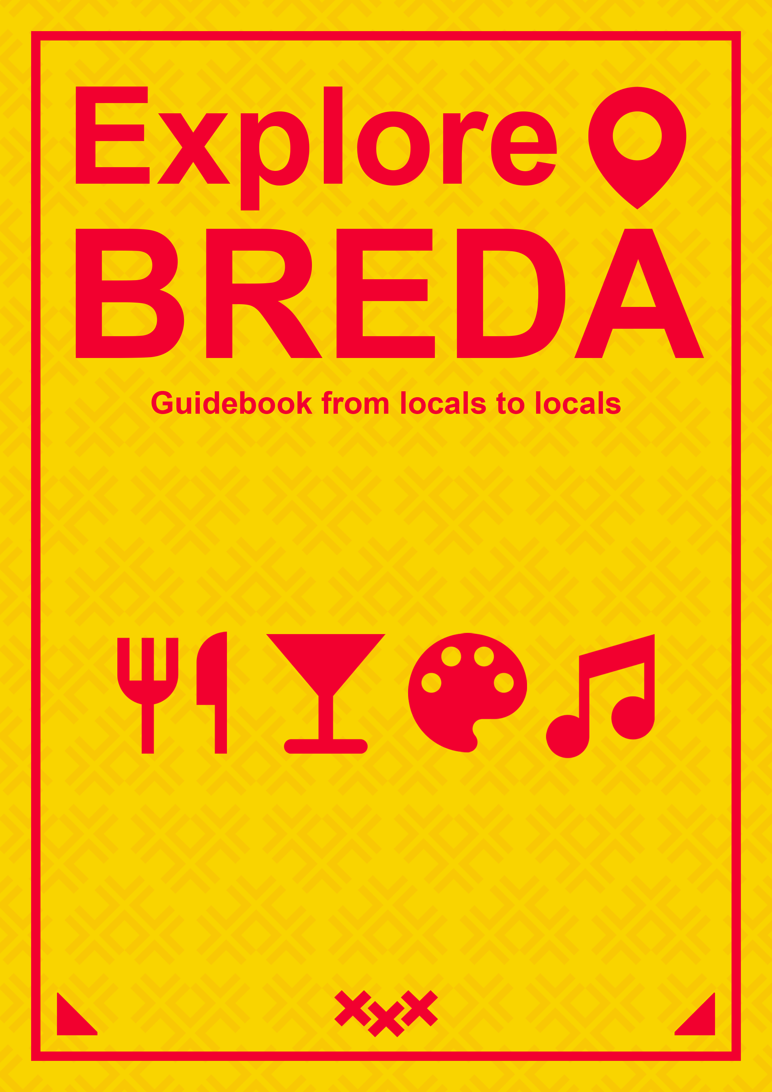
I went through the process of several iterations for the guidebook cover. After completing each version I asked for feedback and acted on it accordingly. At first my main focus was on the page layout and when that was settled I continued with the colors. Below I present my first iteration and the final outcome with several color variants that were shown to the client.

Cover page iteration 1
The first advanced design for the local guidebook cover. I created a background pattern that used the heart shaped city logo and combined it with title text and some visual elements. The design received positive feedback, however I was advised to replace the magnifying glass as it could be mistaken with some sort of gender symbol.
Final Cover page Purple and Gray
The final design that was presented to the client that had some minor changes in comparison to the initial design. The magnifying glass was replaced with a location pin known well from apps like Google Maps and the text plus visual elements allignment was adjusted in order to be more symmetrical. The colors are based on some parts of ExploreBreda website.
Final Cover page Purple and Pink
The final design with different color palette. In this case a combination of purple and pink.
Final Cover page Red and Gray
The final design with different color palette. In this case a combination of red and gray.
Final Cover page Yellow and Red
The final design with different color palette. In this case a combination of yellow and red.

Explore Breda Social Media Mockups

One of the ideas that the team agreed to implement in the marketing ideas was making social media posts that promote the niche places in the city but also show some town residents. Inspired by the Eindhoven’s social media posts about the locals the idea “Official&Local” was born which combines a nice recommendation of places in the city and some practical information about the municipality employees and official business. In order to make the idea more visual, I created some mockups of the social media posts (in this case Instagram).

Social Media Mockup
This social media mockup for Instagram was designed to combine useful information with some eye-catching visual elements. It was designed in a similar style as the local guidebook cover, creating a slider of three seperate images that make one social media posts with a visible contents division.
Social Media Mockup with Red Color
The social media mockup design with an alternative color palette, to show the client some ways of differentiating the content on the Instagram account. In this case, the colors were changed to red and gray.

Reflections

Unfortunately, the communication with the client was hard, since the questions asked through email were hardly answered and with a significant waiting time when the feedback actually happened. It negatively influenced the design process. The main remark that the team received during the final presentation was that the design throughout the elements of our media campaign was not visually consistent and it is a crutial part of the final outcome. I learned that it is important to start from some very basic iterations and ask feedback on them, as presenting people with very advanced design is less efficient in early stages of the process.

Explore Breda Account Badges

As a part of the group’s concept for the website, it was decided that the users contribution level must be visually represented. In order to give the user the sense of reward and progress we came up with the idea for the badges that can be acquired by fulfilling particular tasks and gaining points. I was assigned to make the design for the badges, and since I wanted to get more familiar with the Illustrator software, I was happy to do so. I based the design on well known video game ranks that the player gains when finishing the competitive matches with other players. Starting from the bronze, then silver, gold and ending on a diamond rank. Here is the result I came up with:

Bronze Badge
The bronze badge is meant for new accounts as it is the first step of becoming the website ambassador.
Silver Badge
The silver badge is a next step after bronze, informing that the user has already acquired some amount of points assigned to the account.
Gold Badge
The gold badge is for the account that are regularly receiving points from some time, being a valuable members of the ExploreBreda.nl community.
Diamond Badge
The final, diamond badge, shows that the user is in the elite of website's ambassadors. He is trusted and valued by the ExploreBreda team and other users.

Explore Breda Pop Up Gif

As part of the pop-up message that we implemented into our website, I wanted to make an short animation that would represent the logo of the city in 3D, rotating around the vertical axis of each element. By following tutorials of 3D elements in After Effects and then converting them into gifs by using layers and timeline in Photoshop I ended up with a nice animation.

ExploreBreda gif
This gif presents the city logo in a way it has not been shown before. It is a nice addition to the website as it makes it more alive and dynamic.

Reflections

I am not that familiar with the Illustrator software, it works a lot differently than Photoshop with which I have the biggest experience. However, I can already confirm that for making detailed visual elements it is the most useful tool and I am looking forward to learn more about it. What is more, I was using the After Effects tool for the first time so I found it difficult to navigate the software and make the desired result. Fortunately, I found a couple of tutorials that helped me with the process.

GrabaGra Logo Design

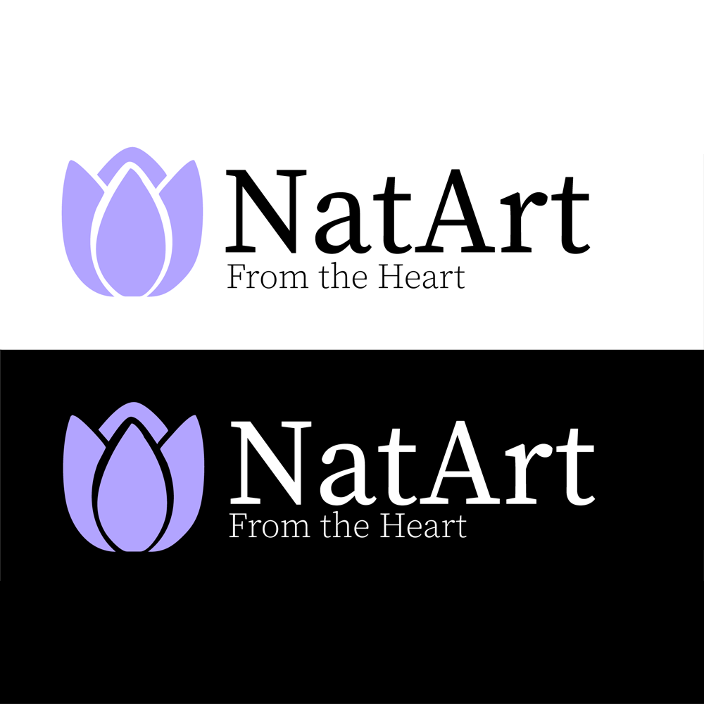
As the base for all other elements, the proper logo design process was crutial to the success of the project. I started with some basic pen and paper sketches that provided some options for the client. There were 9 of them and I was advised to limit the choice for the client in the future by making an initial selection by myself. The more advanced versions of the logos my client liked the most were made in Adobe Illustrator and the results are shown in the images below as well as the final product.

Abstract Logo Design
This design gives the logo a more abstract look, with some rounded shapes that give the brand a more modern logo.
Emoji and GG Logo Design
This design combines a well known fistbump emoji style with an addition of the G letters incorporated into the design.
Square Fistbump GG Logo Design
This design is based on the old logo that is quite simple and rectangular in shape. It is modified by adding the G letters in the design. Creating a more distinguished and unique look.
Square Cut Fistbump Logo Design
This design is also based on the old logo with an additional incorporation of the G letters, however its shape is cut to provide an alternative choice for the client.
Final Design of the Logo
This is the final outcome of the design process. The client sticked with the emoji look with the incorporation of the G letters, however it differs from the initial look as the client asked for multiple adjustments.

GrabaGra Info Panels

The info panels are static elements that are placed on the Twitch channel. Their design can be various, as proved by the panels designs that can be found on many streamers' channels. I started with a couple of simpler propositions in order to gain an insight what the client would like the most. When I received some feedback on my work I was able to create more advanced iterations and then was able to come up with the final product. Here are some designs I worked on.

Simple Panel
Simple panel with some pattern, platform logo and call to action.
Centered Panel
Symmetrical design with darker background, frame parts and call to action.
Advanced Panel
Advanced design with the channel colors, 3D styling, more highlighted logo and call to action.
Final Panel
The final design with the finished logo, color palette based on the corresponding platform.

GrabaGra Stream Scenes

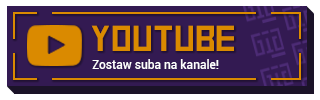
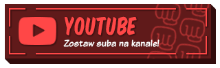
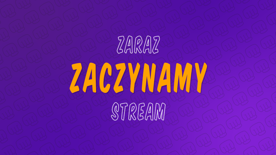
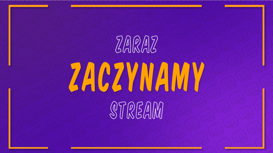
To create the scenes that were supposed to be put on the stream I had to watch many tutorials that helped me make the desired outcome in Adobe After Effects. I wanted to design several scenes for "Starting Soon", "Be right back" and "Stream Ending". I went through several iterations, adding elements and adjusting them to the client's recommendations. The very base of the design idea was the gradient background with a dynamic pattern that incorporated the channel's new logo. Here are some iterations alongside with the final outcome for the "Starting Soon" scene.

Simple Panel
One of the first iterations that consisted only of the dynamic background and the partly animated text.
Centered Panel
In this iteration an orange frame was added that resembled in style the frame present on the info panels design.
Advanced Panel
In this iteration, some social media elements were added in order to fill the empty corners of the design but also promote the streamer's accounts on other platforms.
Final Panel
This is the final design for the "Starting Soon" scene, with some simple animations that make the scene more dynamic as it might be shown for several minutes before the stream actually starts.

Reflections

The biggest downside of the design process was the communication with the client, since he could not really tell me what exactly he aims for with the new design. That is why I ended up with many iterations that I spent hours working on which did not contribute that much to the final outcome. What is more, since I worked during the mornings and rested in the afternoon I was not able to quickly implement changes from the feedback as my client's working hours are usually from 9pm to 3am and he wakes up in the afternoon. On the bright side, I was able to work more with Adobe Illustator and After Effects which will prove handy in my future projects.

My Own Logo Design

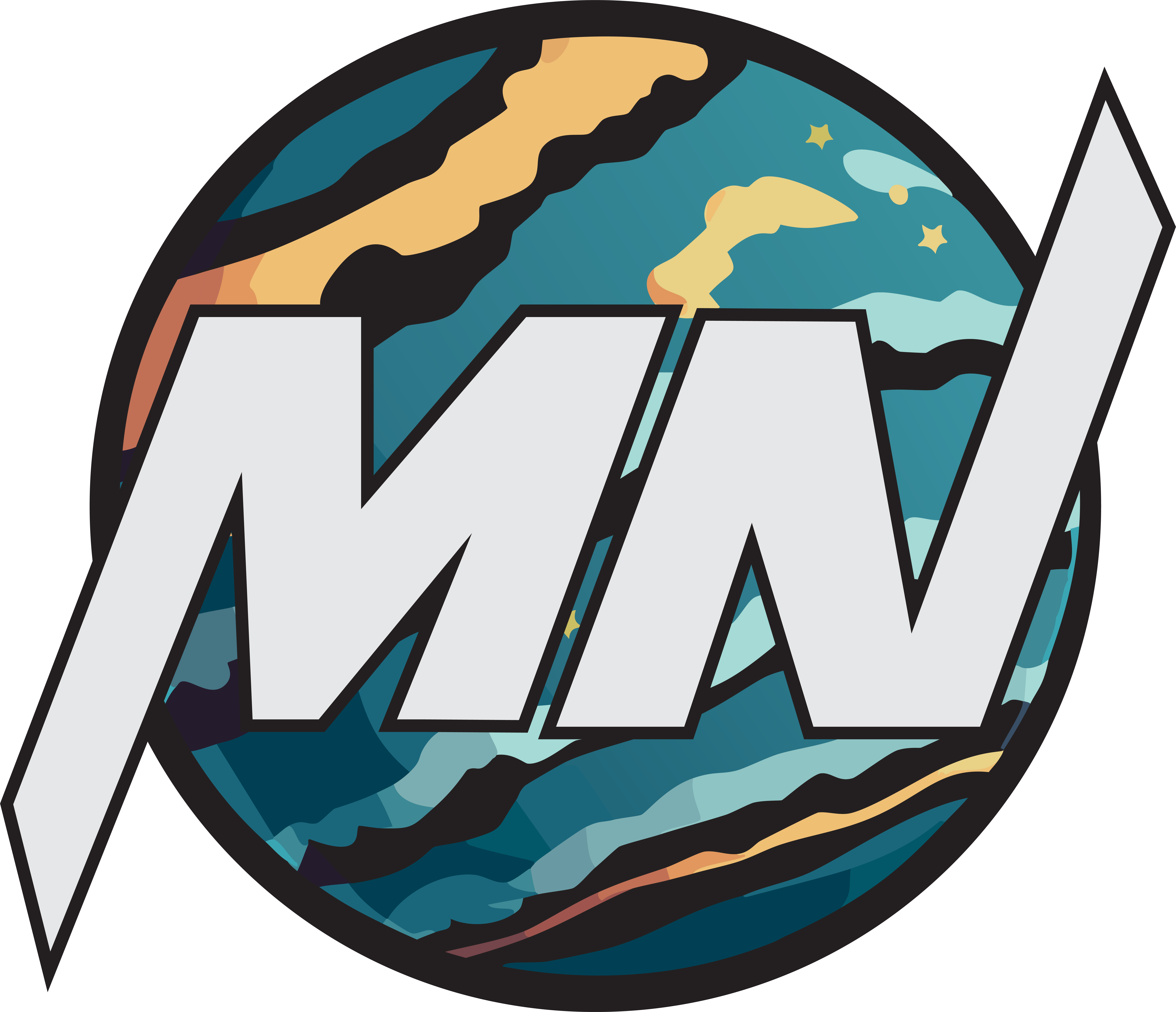
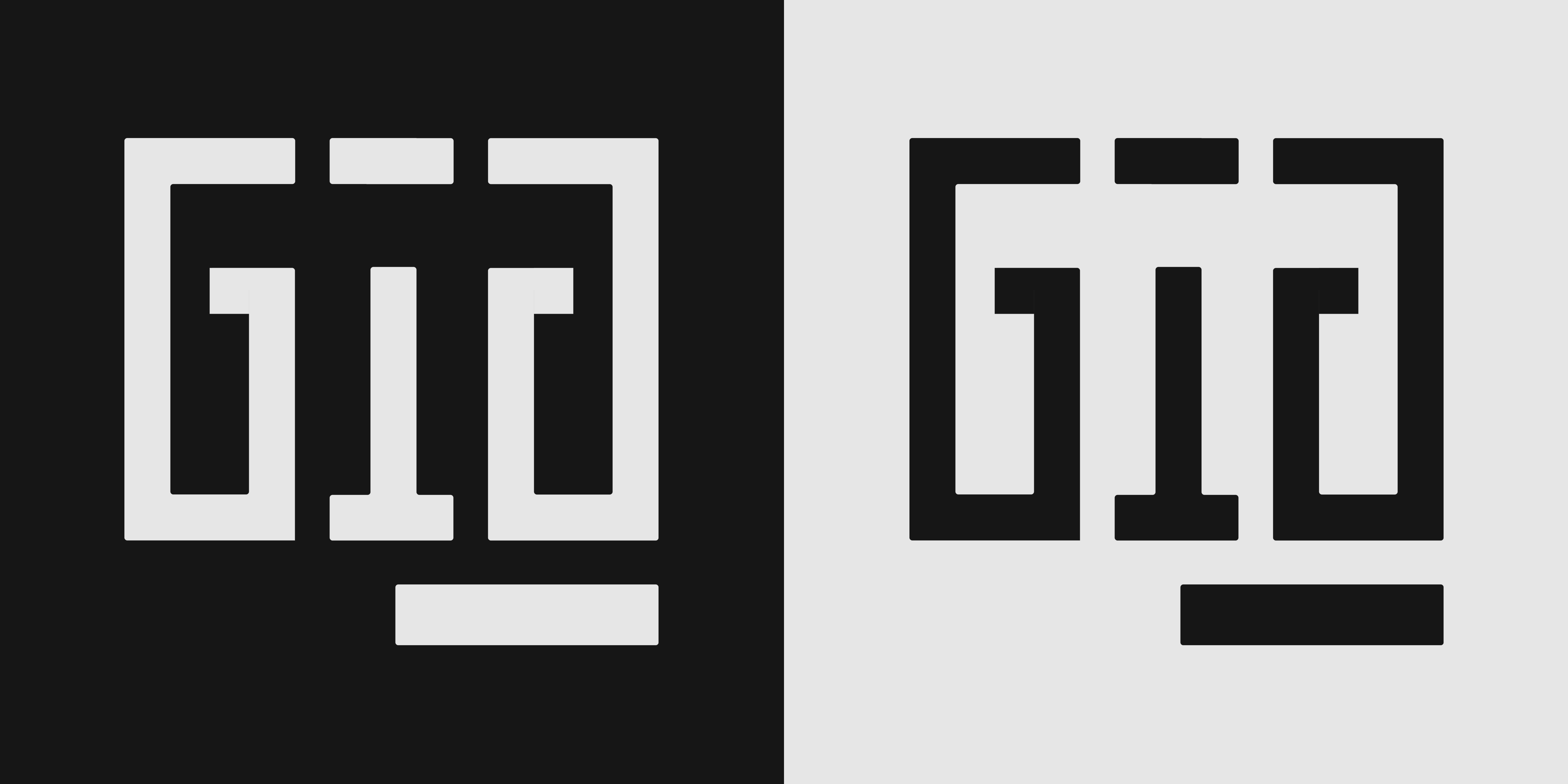
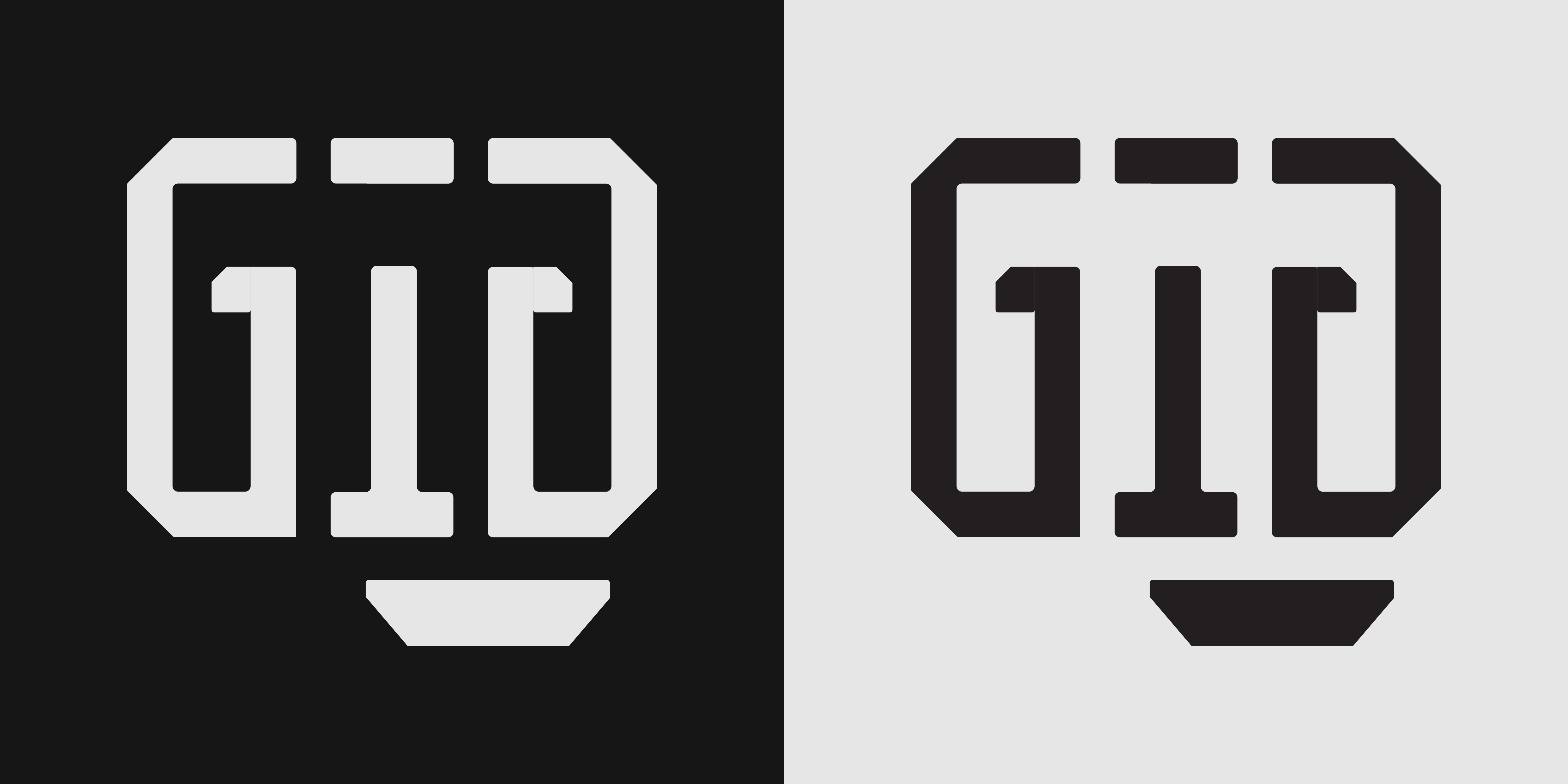
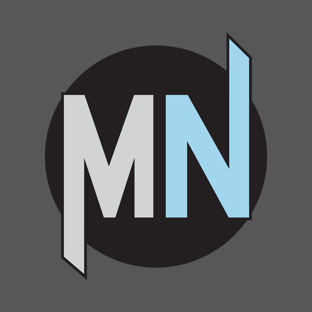
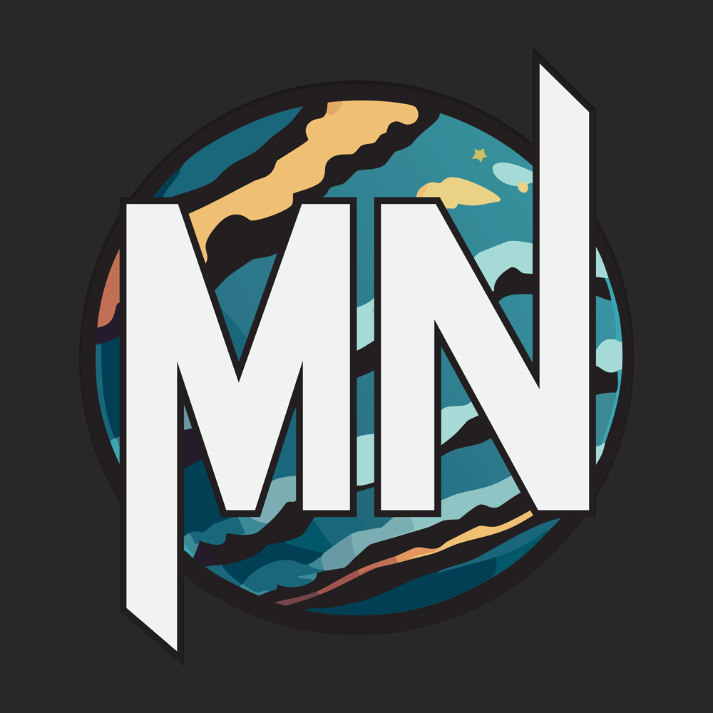
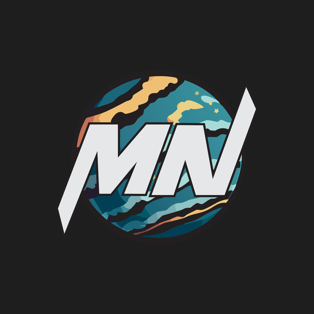
I wanted to create a logo that I will use in my portfolio and that I could continue using as I start making the base for my future brand. I wanted to incorporate my initials in the design and looked up many logos that used similar idea. I also wanted to base it on a circle background that will contribute to more scifi vibe of the logo as I am a big fan of futuristic style. Upon settling on the design idea of my liking I made an initial iteration, than after receiving some feedback from the teacher along the way, I ended up with the final product that I am satisfied with.

MN logo 1
In the early iterations I made the background shape color a solid color and tried to highlight the contrast bestween the letters by applying the different colors. I ended up with the design that reminded me more of a superhero symbol and proceeded with improving the logo.
MN logo 2
In this iteration the background was changed to a nice planet texture that was created with the help of Illustrator AI tool. I also set the letters to the same color as the backround is now colorful enough to make the letters stand out. I received the feedback that the letters could be further modified to add some uniqueness to the design.
MN logo final
In the final design, the letters have beeen tilted and the logo satisfied my needs so I implemented it into my portfolio.

Portfolio Layout and Design

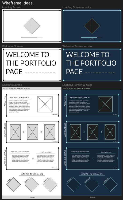
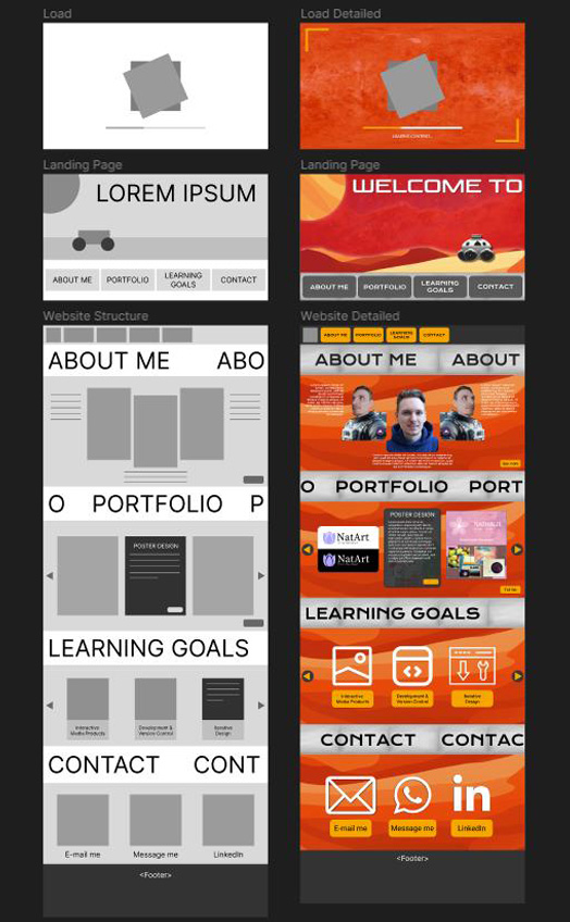
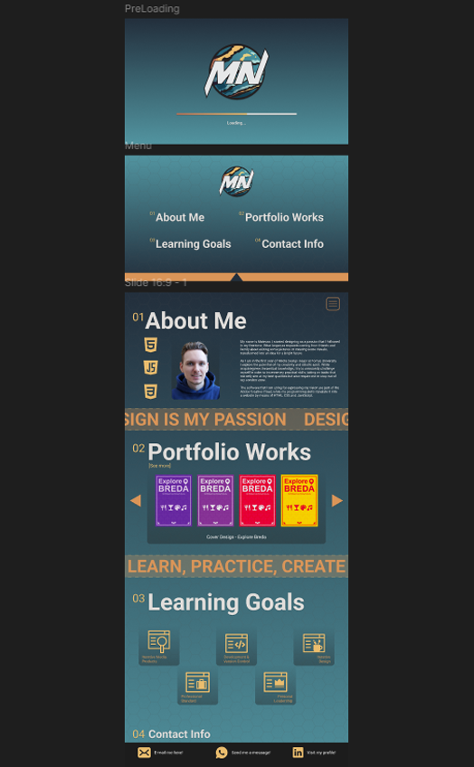
It took me a while to come up with the desired structure of my portfolio, making some pen and paper sketches that I would be a base for more advanced prototypes and eventually the final design. Even though I was sure about the structure I struggled with coming up with the design that I fully liked. I wanted my protfolio to have some dynamic elements, modern style and was easy to navigate. Here are some iterations that I made in the more advanced stages of the prototyping process.

Portfolio Prototype 1
This early idea for the portfolio design was based on the video game style which was supposed to resemble "Final Fantasy VII Remake" main menu. Even though I liked the design, I was recommended to change it as the boxing of various elements online was not valued by the professionals and some decorations were hard to implement and not necessary.
Portfolio Prototype 2
This prototype style was aiming more for the Mars exploration style which provided a less boxed design and had potential for implementing some dynamic elements. However after experimenting with the color palette I found it difficult to make something that pleases the eye and still keeps the color palette of Mars exploration.
Portfolio Prototype 3
In this prototype, I settled on the final structure of my portfolio that was not that different from my initial idea. I based my color palette on the logo I created I liked the outcome of this choice. The coding required me to change some elements in the end as my skill in translating the prototype into HTML, CSS and JavaScript was not enough.

Reflections

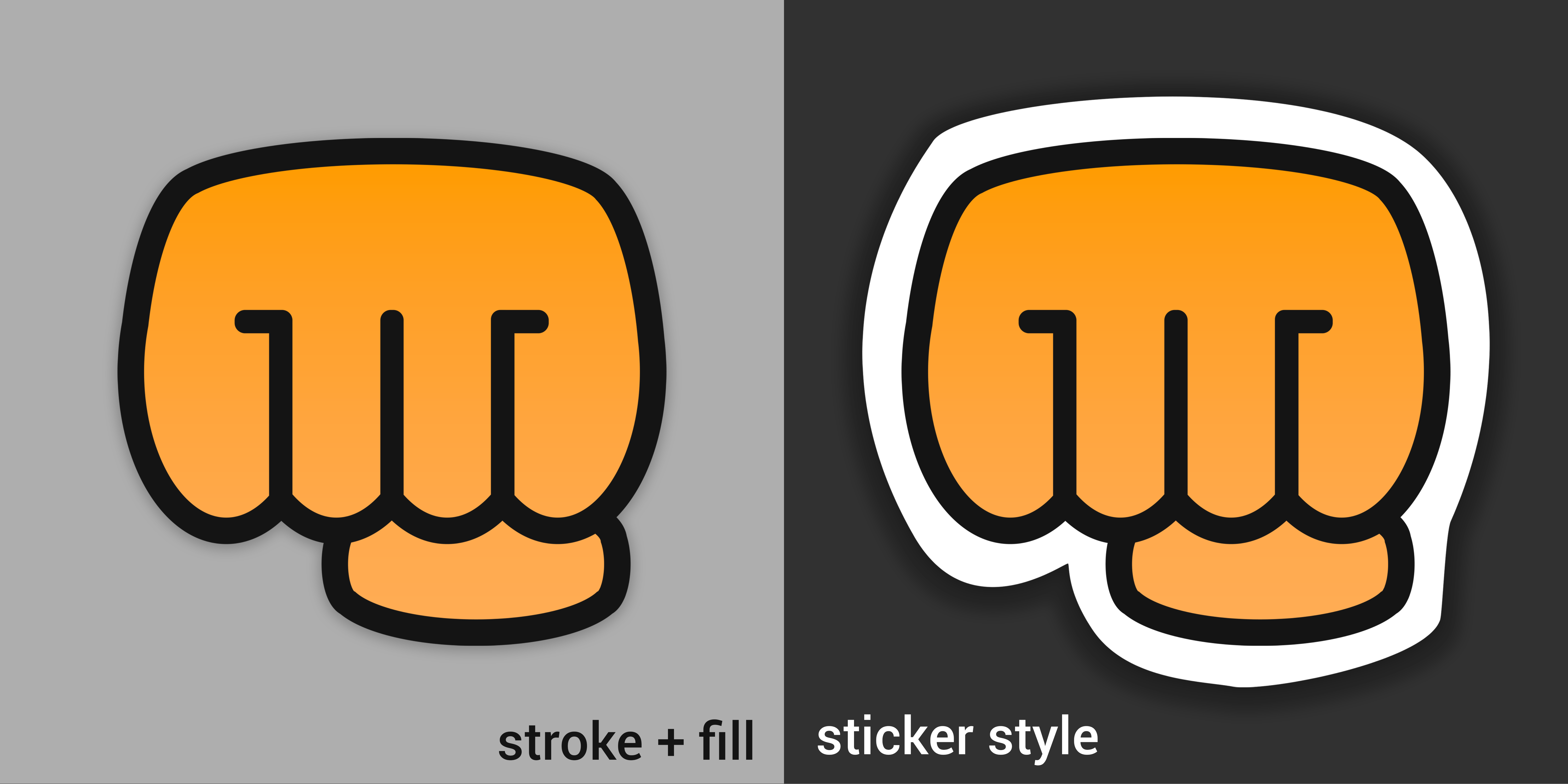
It was fun to design the logo for myself as I had an attempt on it in the previous semester but my skills were not there yet. Working on it helped me gain more experience in Adobe Illustrator which proved essential in designing such a creative and unique image with the best quality. It also gave me a better insights on the designing process, starting from scratch and asking for feedback people with the bigger experience in designing.