This showcase will take you throughout the various elements that are vital for the twitch broadcaster and allow the streamer to provide the viewers with the best experience during the live transmission and outside of it. In this case, I was working in cooperation with a known Polish Streamer Pawel “GrabaGra” Grabowski, gaining feedback from him and his community to deliver a pack of visuals that he can use in the future. This streamer has been in the industry for over 10 years working with well known brands like Playstation, Nvidia or Red Bull.


The brand logo is a significant element to the Twitch streamer, same as any other brand in different industries. A nicely done channel logo grabs the viewer’s attention, helping the broadcaster to stand out among the competition. The design should be consistent with the brand identity and the associated values. It also is a base for the other visual elements placed on the channel and stream layout such as subscriber badges, info panels, banner or even merchandise.

Since the streamer has been in the industry for over 10 years, already making a certain impression with his community, it was more of a case of redesigning the old logo in a way that appears more modern and give a sense of refreshment among the viewers. The simple rectangular shaped fist-bump logo associated perfectly with the channels identity and the broadcaster’s values, which were: fun, friendliness and good energy. The redesign is adjusted more to the social media era, resembling a fist-bump emote that everybody knows but with an unique take that implements the channel capital letters G and G into the final shape.
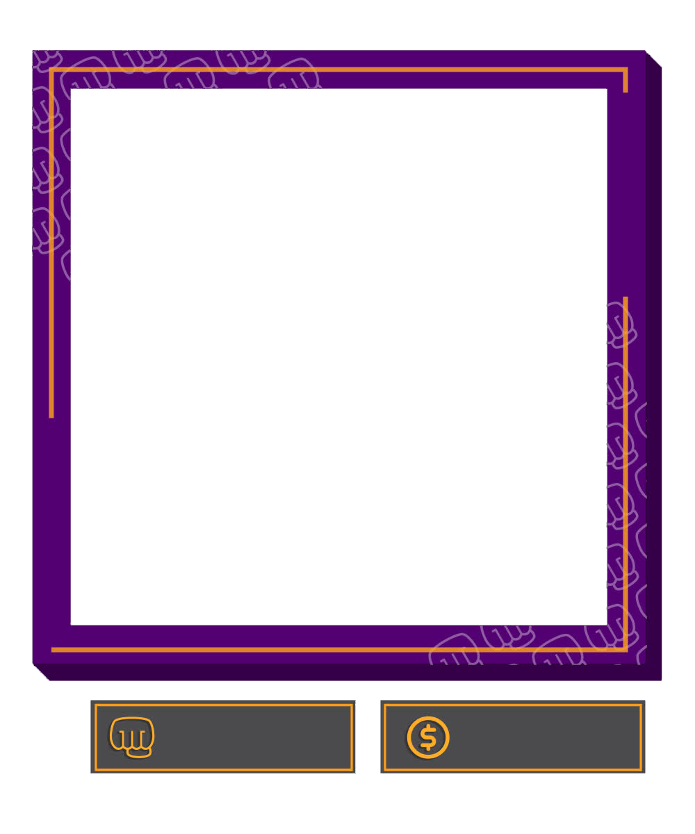
Information Panels provide the broadcasters with a space to customize the channel with information, links and images that advertise their social media, community, partnerships or other things. It is a nice addition that allows the viewer to find more intuitive and eye-catching way to navigate throughout the information provided by the broadcaster.


The design I created was inspired by a retro gaming visual style, the shape referring to the classic NES controller. The main elements of the design are the logos, text corresponding to the particular logo and a short “call to action” paragraph. Even though the pattern of the panel remains consistent throughout all items, the color palette of each item was adjusted to better differentiate between them and give the user better association with the thing it redirects to. For instance, Youtube platform is associated with the red color.
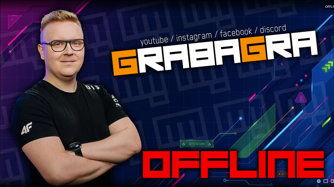
When the stream is starting, the streamer is taking a short brake or when the transmission is ending. The scenes come in handy in each of those cases. The creator rarely starts the livestream right the away after going online. It is clever to wait a few minutes so the streamer's community have time to see the notification and open the Twitch channel. I have created some dynamic designs for the moments when nothing particular is happening on screen and the streamer needs to get off camera. Stream starting soon, be right back, ending the stream and a nice transition as a cherry on top.


I wanted to make the design similar to the style of the information panels. That is way I implemented the same font, a nice pattern created from the the logo and the frame that is also present in the info panels design. In order to make the text more dynamic I used After Effects to make a sequence of letter stroke appearing and disappearing. The transition animation is fast, includes the creator's logo and works perfectly with other scenes.
Some streamers use a popular technique of utilizing greenscreen in order to remove their background on the camera. In some cases it proves to be very uncomfortable to set because greenscreen and its frame take a lot of space in the room. It has to be set up and then folded after the stream which is time consuming. For the people that show themselves in a rectangular shaped camera capture, it is important to have an overlay that make their layout more unique.